Case study · In progress
The Artistic Eye: A Brand for a Gallery That Sells Glasses
The Artistic Eye is two businesses in one room: an art gallery and an optical shop. I am building the whole brand through my LLC, and it has to work on a business card and on an 11.2 ft flag.
This page is updated as the work ships. What is here is what has been made; what is still being decided is marked as open.
The client
A gallery first, and an eyewear shop inside it.
The shop sits inside the Tambourine Lounge, a retro building in Sturgeon Bay full of working artists and recording studios. It is run by Naomi Moes, an artist who sells the frames alongside her own work. Original artwork and studio space share the room with designer frames and a wall of more than two hundred vintage frames from the 1950s through the 1990s. Visits are by appointment.
That was the brief in one sentence: it should feel like a gallery, not a clinic. The brand had to hold art and eyewear at the same time.
What I built
A wordmark, a monogram, and the rules that keep them consistent.
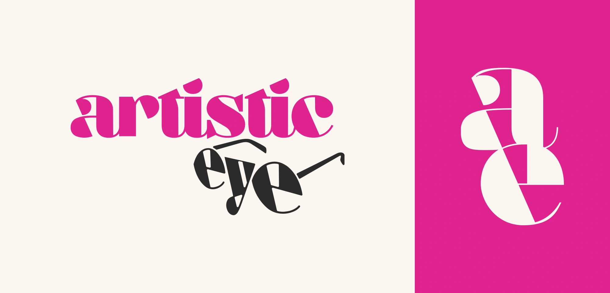
The wordmark. "artistic" set large in pink, with "eye" in charcoal below it, wearing a pair of frames.
The monogram. A stacked a and e. It carries the brand anywhere the full wordmark will not fit or would be too much, like the card back and the flags. It is documented in six colorways.
Color and type. The palette is built on one pink and one charcoal. Aziga for display, set with a little added letterspacing, and Neue Haas Grotesk Text for everything that has to be read.
The guidelines. Lockups, clear space, eight misuse rules, and an asset index, written for the people who will produce work in the brand's name without me in the room: printers, sign shops, partner boutiques, and staff.
- 6Monogram colorways
- 8Misuse rules
- 11.2 ftDouble-sided street flags
Where it lives so far
From a 3.5 inch card to an 11.2 ft flag.
Business cards. A card back carrying the monogram, and three front options for Naomi's card, which differ in the pink and in the typeface for her name.
Social. Graphics built in the same system.
Teardrop flags. Double-sided, 11.2 ft tall, with pink monograms and stacked letterforms in white. At that size the monogram is the whole message, so it had to read from the street before anyone gets close enough to read a word.
What I had to work around
The files did not agree on what black is.
Pulling the brand into one guide turned up a mismatch. The logo masters and one card front used a charcoal, #2B2C2B, and a pink, #DF248E. A second card front and the card back used pure black and a hotter process pink, #EC008C. Neither set was wrong on its own. Together they meant two printers could each follow the files and hand back two different brands.
The dark ink is settled: #2B2C2B everywhere, and pure black gets corrected wherever the artwork carries it. The pink is still open, and the guide says so in writing rather than quietly picking one. A guide that hides an undecided color is how the mismatch happened in the first place.
What is next
The work is still going.
The next decision is the pink. After that, more of the shop's surfaces get made in the system, and this page picks them up as they ship.